


Berecon Construction —
Brand Identity
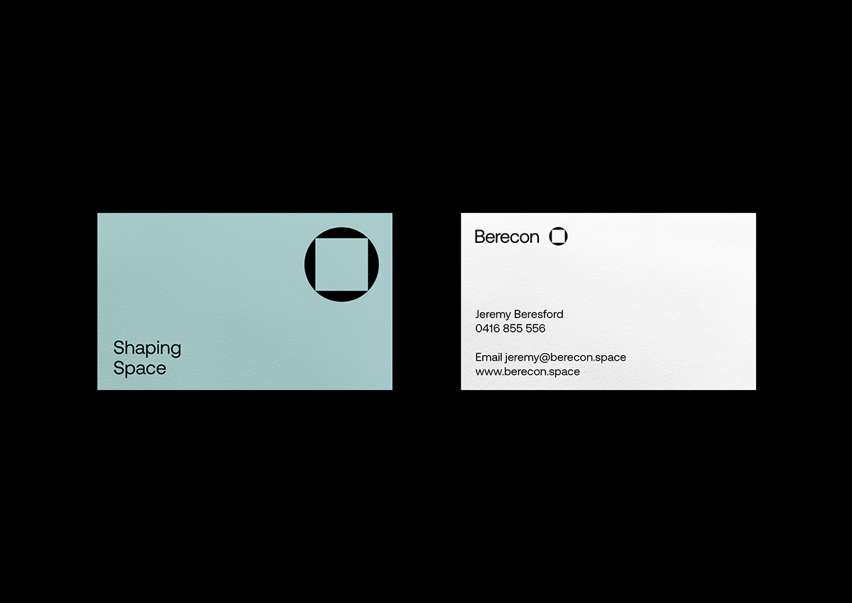
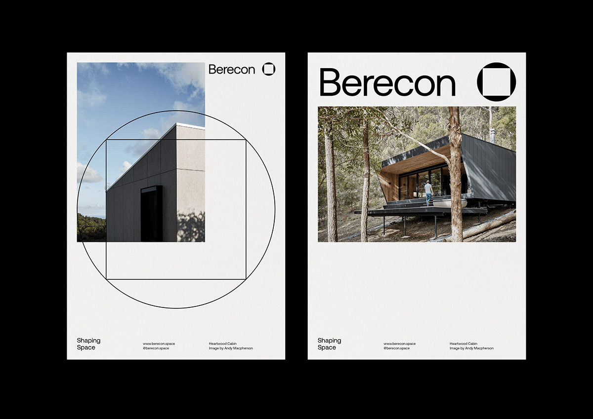
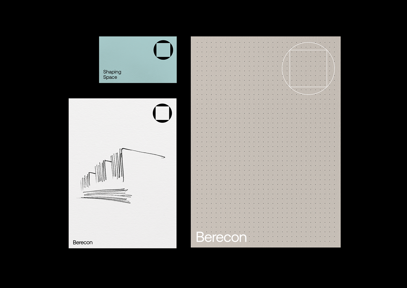
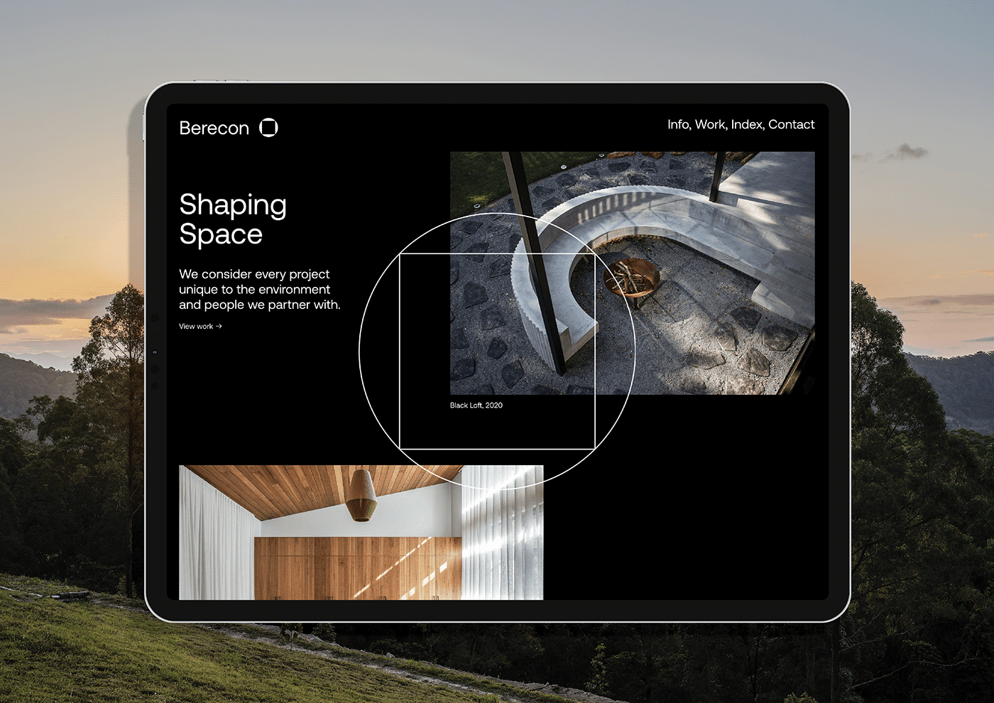
Berecon have built a notable reputation in the Northern Rivers region of NSW Australia for shaping spaces that balance their client’s desires and the site’s environmental realities. This requires nonconformist and divergent thinking on their part, and with construction in mind, we arrived at the concept of ‘a square peg in a round hole’. This visual also had a fortuitous connection to the ‘square drive’ screwdriver head, which was an innovative device in the history of construction (invented in 1908 by Canadian P.L. Robertson).


Brand and Website by Gangplank
Photography by Andy Macpherson
Words by Michelle Bailey
Typeface Aeonik Pro by CoType Foundry
Photography by Andy Macpherson
Words by Michelle Bailey
Typeface Aeonik Pro by CoType Foundry
Client Berecon
Follow @StudioGangplank
Get in touch studio@gangplank.com.au


